
12.31.2010
12.29.2010
12.24.2010
12.19.2010
12.18.2010
12.17.2010
reading...
just checked out 2 books from Jen Library (SCAD's library) today.
Alexander Lawson's "Anatomy of a Typeface" (ISBN 0-87923-333-8) & Walter Tracy's "Letters of Credit, A View of Type Design" (ISBN 1-56792-240-6)
I am very excited about studying the how and why of some of the most recognized and appreciated typefaces to date.
I will post the highlights when I've finished and hopefully some new type ideas as well
12.11.2010
pages from a book...
photos (some blurry) taken from a book on the history of handwriting and letterforms.
click on an image to enlarge.


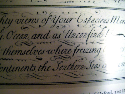
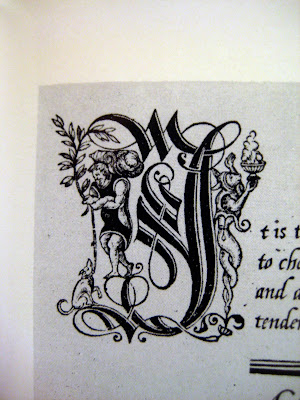
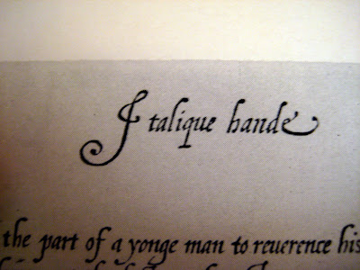
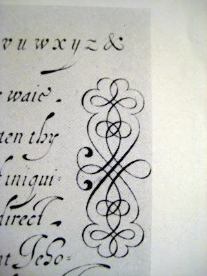

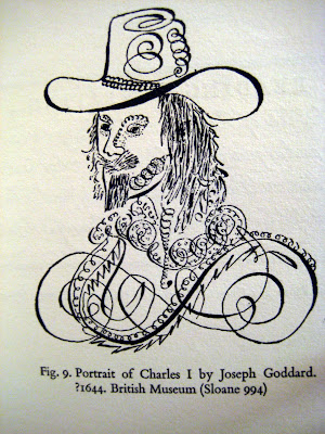
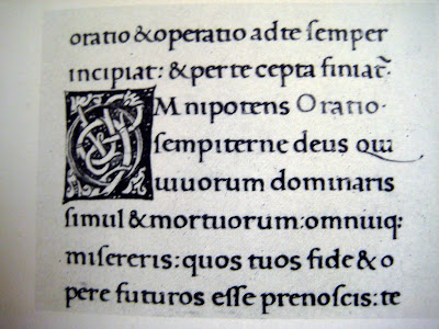

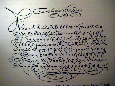
edit: the book is "Story of Handwriting, Origins and Development" by Alfred Fairbank
12.09.2010
12.07.2010
J. Crew logo
the J. Crew winter 2010 catalog came in the mail a few days ago and I noticed something different about the J. Crew logo.
First, this is what I am familiar with:

www.jcrew.com
Here is the catalog and a close up of the 'new' logo
the "J" in question is now no longer represented with a descender.
I much prefer the "J" on the website but wonder how and why this one was printed and shipped across America (and the world).
thoughts?
Subscribe to:
Comments (Atom)


