3.18.2011

cigar labels

Here are some cigar labels from past cigars I've had the fortune of enjoying & now scanning, uploading & posting.


3.16.2011

chimère

I bought this set of 5 cards in Paris, France. I've just gotten around to scanning and posting them.

3.15.2011

Tidal release [free]

link to the full project on Behance http://www.behance.net/gallery/Tidal/1046695

Tidal is a friendly, soft slab serif typeface. A heavy weight face with a welcoming feel. Hand drawn with organic & juicy contours. Perfect for headlines, posters or large print. Features 94 glyphs.
this typeface is free and can be downloaded at www.mattyow.com/tidal


3.13.2011

birthday gifts

so I love birthdays. this year I got some pretty awesome stuff.
Designing Type by Karen Chang;
Lettering & Type by Bruce Willen & Nolan Strals
also a sweet homemade pillow by Lisa. Monogramed with a Rockwell Y.


forgive to poor color in the photographs.

I also got a new battery for my MacBook Pro (as I'm typing this, my old battery says, "Condition: Replace Now" at 17%, "You are now running on reserve battery")
#birthday

3.11.2011

march 11, 2001

today is my birthday. its once a year. I'm 24 today.
#birthday

I also share a birthday with Josh Bielick.

3.10.2011

icons [update]

I've updated 3 of the icons from a previous post. The ruler here scales better, the lightbulb is more iconic & the dialogue (speech bubble) is tweaked just a bit.
I'll post the poster of the final project soon. promise.

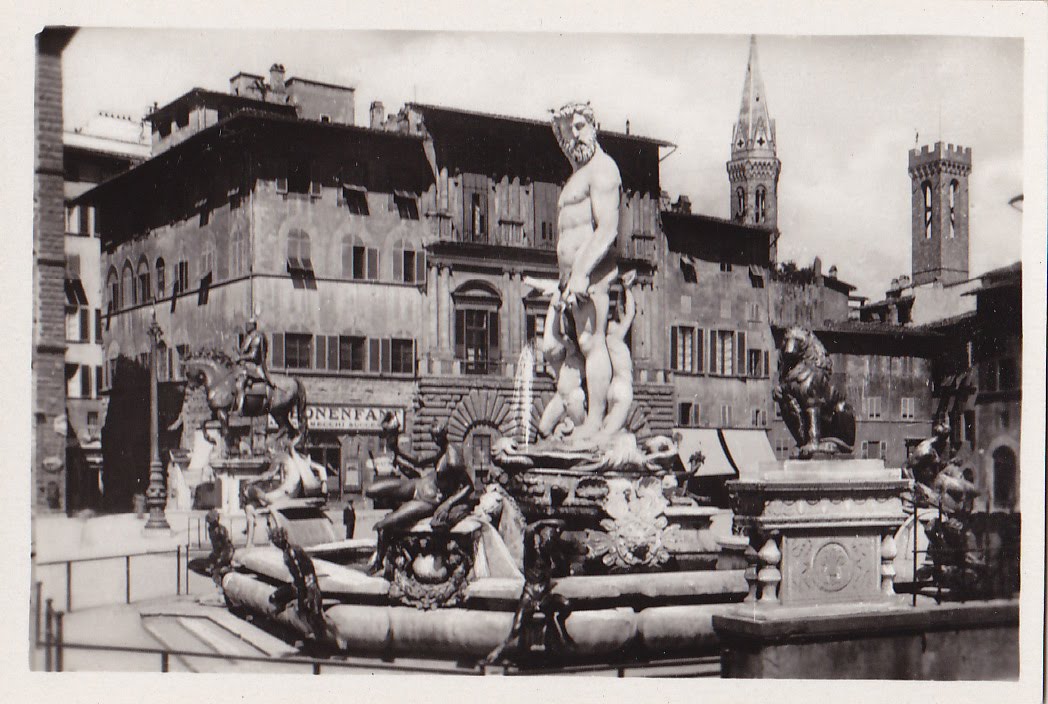
Florence, Italy

I bought these for 5 euro in the Netherlands at a flea market.
Pack of 20 photos of Florence, Italy.
The cover of the package says:
20 Vere Fotografie
Firenze
Principali Vedute


(click to enlarge)

3.08.2011

metal type

Linotype letters from Paris Market, Savannah, GA. $1 a piece.

Cooper Black
c_t ligature!
didone R
didone ampersand.
if anyone knows the name of this typeface, let me know...
Futura ampersand

icons

23 icons created for a project: "what is graphic design?"
these are in a loose order of top to bottom.
Ideation, time, observation, travel, sketch, cut, document, research, measure, listen/understand, eat, caffeinate, communicate, digitize, select, type, pen tool, rest/sleep, print, color, modify/digitize, organize, compensate.

the light bulb, ruler & speech bubble could use a little more work. I'll post updates later

3.06.2011

cisco systems

So I've dealt with Cisco Systems customer service recently with a lame wireless router. I've spent the time on hold staring at the logo printed on the device and really started liking it. I did some research on the brand and came across a few relevant, if slightly dated, articles.


The company started in San Francisco in 1984. The name is abbreviated from Francisco & the mark (as seen in the earliest logo) derives from the Golden Gate Bridge. Whats been done to the most recent rebrand is a huge step into the "timelessness" that companies reach for. The typeface is entirely custom and aptly title Cisco (with accompanying Cisco Serif). see http://new.myfonts.com/WhatTheFont/forum/case/100675/ for more details.

I ran across the following article looking for the branding & advertising agency involved. Unfortunately, every single sentence lacks insight or consideration; just seems ill informed.

"IT LOOKS LIKE Cisco is rebranding again. Check out the new logo shown off to investors yesterday: (see above)

Companies like this never do anything, much less anything of this magnitude without a massive army of consultants who put a meaning behind each and every pixel. This gets expensive, and the writing of checks with lots of zeros in them assures CxOs that they shelled out for something worthwile.


Since I was not informed of the meaning behind the logo, I will attempt to discern it for myself. We will start out with the washed out colors, a faded steel blue and a nondescript red. They mimic the pale skin tones of the pasty faced wiring closet trolls that so love Cisco equipment, a tip of the hat to you boys and girls.

The vertical lines are really feng shui based, but far from providing easy access for dragons to pass, it is actually landing lights for them. You don't think Cisco keeps it's marketshare through high prices alone do you, it needs large reptilian help.

Moving on, we get to the font, a classic early 80s mac piece meant to show the advanced nature of the Cisco UIs. If IOS can do that fancy graphical stuff, our fonts can too, the PARC boys would be so proud of this achievement, you can almost see them shrug with apathy over this moment.

Last up, we have the sheer blandness of it all, meant to promote the nigh boundless excitement of a closet full of boxes who's only purpose seems to be making LEDs blink and fans pushing hot air out the back. Be still my beating heart, Cisco seems to have hit a home run here."

By Charlie Demerjian

http://www.theinquirer.net/inquirer/news/1035225/cisco-logo

That said, I like the logo. Its a great abstraction from previous marks of the company while still being wholly recognizable. The typeface is modern & sturdy. The colors are a bit corporate and slightly dissonant; could be a less grey blue and more maroon kind of red. Its 5 years old now anyway. I'm a little late.


Another great site; one of my sources: http://www.underconsideration.com/speakup/archives/002795.html


finally, consider a good logo can scale to 16x16 pixels and still be recognizable.

3.03.2011

Lion


its that simple.

2.26.2011

Satellite release [free]

I released Satellite for free yesterday. The link to the project is here http://www.behance.net/gallery/Satellite/453305
and here is a direct link to the download www.mattyow.com/satellite


spread the word. enjoy.