
12.31.2010
12.29.2010
Crested Butte Cupcakes
here is the business card & new logo for Crested Butte Cupcakes.

typefaces: St Marie & Avenir
12.24.2010


12.19.2010

12.18.2010

12.17.2010

reading...
just checked out 2 books from Jen Library (SCAD's library) today.
Alexander Lawson's "Anatomy of a Typeface" (ISBN 0-87923-333-8) & Walter Tracy's "Letters of Credit, A View of Type Design" (ISBN 1-56792-240-6)
I am very excited about studying the how and why of some of the most recognized and appreciated typefaces to date.
I will post the highlights when I've finished and hopefully some new type ideas as well
12.11.2010
pages from a book...
photos (some blurry) taken from a book on the history of handwriting and letterforms.
click on an image to enlarge.


edit: the book is "Story of Handwriting, Origins and Development" by Alfred Fairbank


12.09.2010
Holga, RDU
here are some Holga photographs of RDU (Raleigh Durham International Airport).


more of these to come
12.07.2010
J. Crew logo
the J. Crew winter 2010 catalog came in the mail a few days ago and I noticed something different about the J. Crew logo.
First, this is what I am familiar with:

www.jcrew.com
Here is the catalog and a close up of the 'new' logo
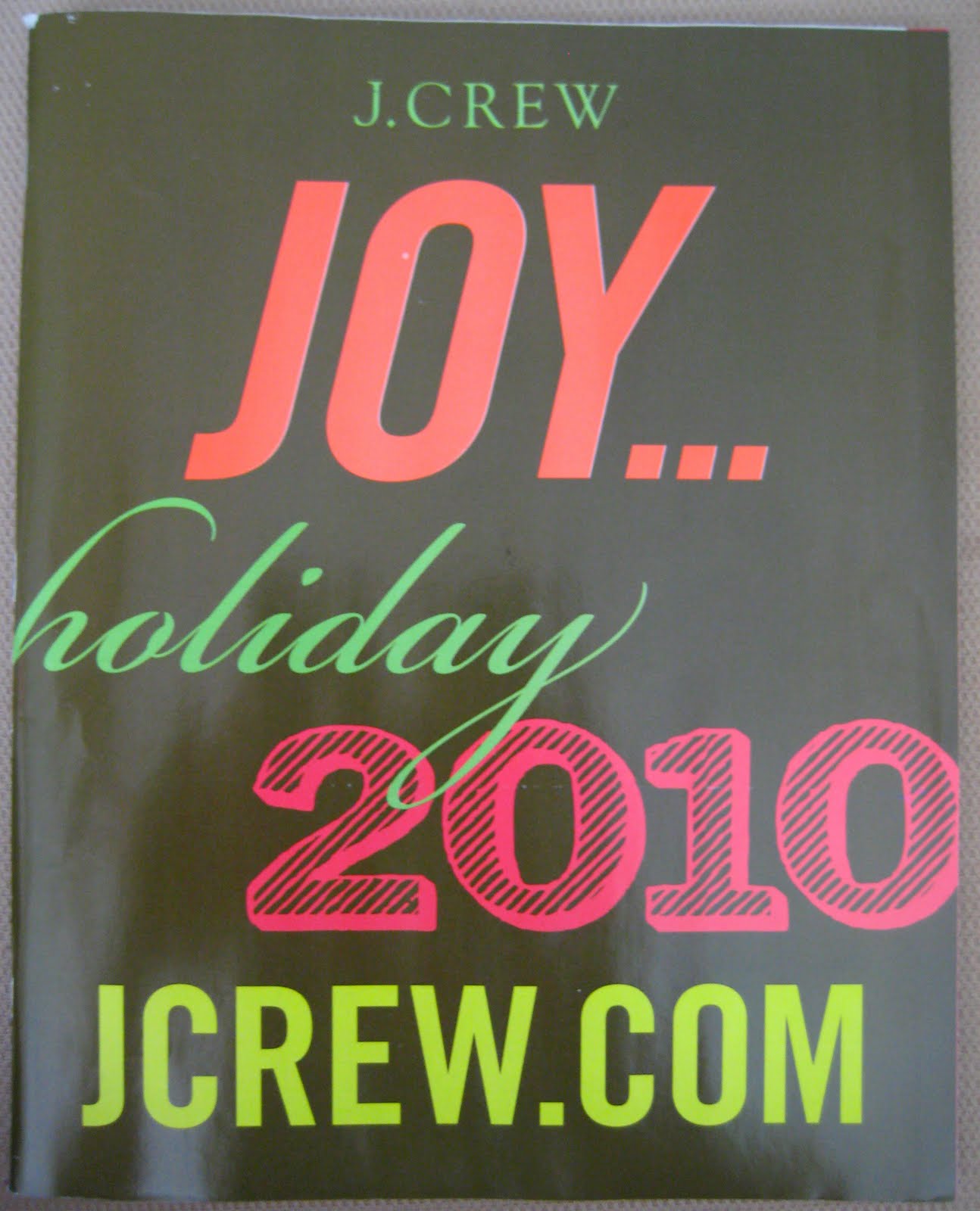

the "J" in question is now no longer represented with a descender.
I much prefer the "J" on the website but wonder how and why this one was printed and shipped across America (and the world).
thoughts?
Subscribe to:
Posts (Atom)